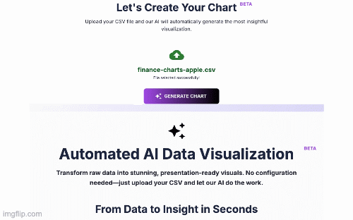
Let's Create Your Chart
BETAUpload your CSV file and our AI will automatically generate the most insightful visualization.
Sign In to Secure Your Workspace
For your privacy, every chart is generated in a secure, private session. Sign in to upload your data and create your first visualization.
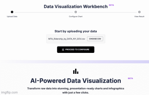
Automated AI Data Visualization
BETATransform raw data into stunning, presentation-ready visuals. No configuration needed—just upload your CSV and let our AI do the work.
From Data to Insight in Seconds
1. Upload Your CSV
Securely upload your raw data file.
2. AI Analyzes & Selects
Our AI analyzes your data's structure and determines the most impactful chart type to tell its story.
3. Get Your Visualization
Receive a polished, high-quality chart, ready to be used in your reports and presentations.
Why You'll Love Automated Visualization
Zero Configuration
No need to pick chart types or map columns. Our AI handles all the complex decisions for you.
Save Hours of Work
Eliminate tedious manual chart-building and get straight to the insights. Focus on your strategy, not the software.
Instant Clarity
Perfect for quickly understanding new datasets, finding hidden trends, and communicating key findings with impact.
Go from data to decision in seconds
An AI engine analyzes your dataset’s structure and relationships, then auto‑selects the most effective visualization—no manual chart picking, axis mapping, or styling required.
Upload CSV
AI analyzes
Chart appears
What is Automated AI Data Visualization?
Automated AI Data Visualization is a revolutionary approach to data analysis that uses artificial intelligence to bridge the gap between raw data and insightful charts. Instead of relying on a human to manually select chart types, map columns, and configure settings, an AI engine analyzes the dataset's structure, understands the relationships between variables, and automatically generates the most effective and clear visualization to represent the primary insight.
It’s the ultimate no‑code solution for anyone who needs to quickly understand and communicate with data—without the steep learning curve of traditional BI tools.
Who is this for? Real‑World Use Cases
Marketing Managers
Turn campaign CSVs into compelling charts for weekly reports. Track ROI, visualize funnels, and present confidently.
Business Analysts
Accelerate EDA: get a first look at trends and outliers before deep‑dive analysis.
Founders & Entrepreneurs
Understand your business at a glance. Drop in sales or activity logs and see key metrics without a data team.
Students & Researchers
Produce publication‑quality visuals for papers and presentations in a fraction of the time.
Examples of what you can visualize
- Time‑series data to see trends over time.
- Categorical data to compare groups (e.g., sales by region).
- Correlation data showing relationships between numerical variables.
- …and much more. The AI picks the right chart.
Frequently Asked Questions
1) What file types can I upload?
Currently optimized for clean, well‑structured .csv files. Support for Excel (.xlsx) and other formats is on the roadmap.
2) Is my data secure with Datum Fuse?
Yes. Uploaded input files are treated as ephemeral and are deleted from operational servers immediately after processing (see Terms of Service for details).
3) What if the AI chooses the “wrong” chart?
The AI selects a statistically appropriate default for quick insight. If you have a specific story to tell, use the Flexible Charting Studio for full control over chart type and axes.
4) Can I customize the chart’s look?
Automated Visualization prioritizes speed and smart defaults. For full control of titles, labels, and colors, switch to the Flexible Charting Studio.
Ready to transform your data?
Stop wasting time on tedious chart‑building. Upload your first CSV and get an instant, presentation‑ready chart.