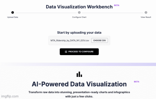
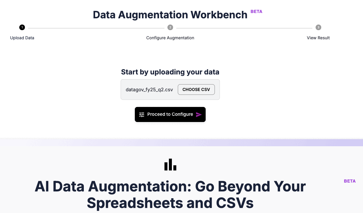
Data Visualization Workbench
BETAStart by uploading your data
Sign In to Secure Your Workspace
For your privacy, every chart is generated in a secure, private session. Sign in to upload your data and create your first flexible visualization.
AI-Powered Data Visualization
BETATransform raw data into stunning, presentation-ready charts and infographics with just a few clicks.
From Spreadsheet to Story, Effortlessly
Raw numbers and spreadsheets can be overwhelming. A well-crafted chart instantly brings clarity, reveals trends, and tells a powerful story.
DatumFuse.AI automates this transformation. Forget wrestling with complex software—let our intelligent system guide you to the most impactful visualization for your specific dataset.
Intelligent Features, User-Controlled Results
Smart Chart Suggestions
Our AI analyzes your CSV, understands column types, and suggests the most relevant chart options for your data.
You Choose the Chart Type
Don't just accept a suggestion. Explore your data from multiple angles by choosing from Bar, Line, Scatter, Pie, and more.
Professional Customization
Add custom titles and axis labels to create polished, publication-quality graphics ready for any report or presentation.
A Universe of Visuals: Chart Types We Support
Our studio is a creative canvas for your data. AI suggests the best starting point, and you stay in control—choose, compare, and customize the visuals that tell your story.
Our Flexible Charting Studio is not just a tool; it’s a full library of chart types—each suited to a different kind of insight. Explore alternatives, compare perspectives, and build the exact visualization you need.
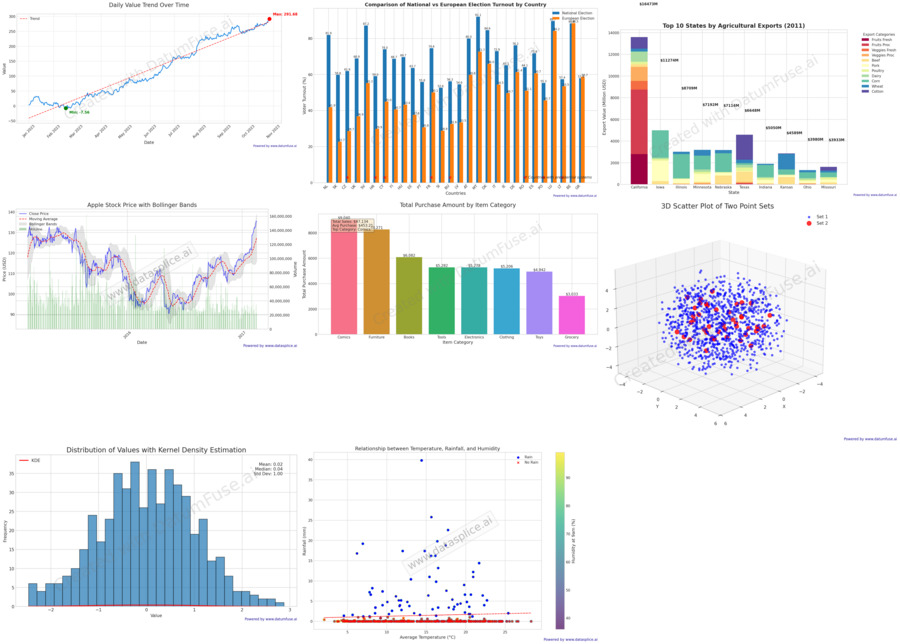
Bar Charts
Perfect for comparing categories. See top sellers, compare channel performance, or analyze survey responses.
Line Charts
Ideal for trends over time—revenue growth, traffic monitoring, or market movement with crystal clarity.
Scatter Plots
Reveal relationships between two numerical variables—e.g., ad spend vs. sales, temperature vs. ice cream sales.
Pie Charts
Show parts of a whole—market share, budget allocation, or user composition at a glance.
Histograms
Understand distributions—customer ages, price bands, and more, binned into meaningful ranges.
Who is the Flexible Charting Studio For?
Data Analysts
Rapidly prototype multiple visualizations. Generate several chart types in minutes to find the most compelling angle.
Marketing Professionals
Create a suite of charts for monthly/quarterly reports—lines for trends, bars for channels, pies for breakdowns.
Product Managers
Explore user behavior—scatter plots for correlations (usage vs. retention), bars for comparing segments.
Researchers
View findings from multiple perspectives. One dataset can yield many insights with different visuals.
Frequently Asked Questions
1) How is this different from the Automated Visualization tool?
Automated Visualization is about speed—you upload a CSV and get one best‑fit chart, instantly. The Flexible Studio puts you in the driver’s seat to explore multiple, specific, and customized charts from the same dataset.
2) What if I pick a chart that doesn’t fit my data?
We validate your selections and provide clear guidance. For example, if a scatter plot is attempted with text columns, you’ll be prompted to choose numerical fields.
3) Can I save the charts I create?
Yes—every chart is exported as a high‑quality PNG for immediate download. Registered users also see recent jobs and charts in their Dashboard for a limited time.
4) What if my data has too many categories?
Intelligent guardrails prevent unreadable visuals. If a column has too many unique values (e.g., 1,000 product names), you’ll be prompted to choose a simpler field.
Ready to become the director of your data story?
Upload your CSV, explore our full chart library, and build visuals with power and clarity.